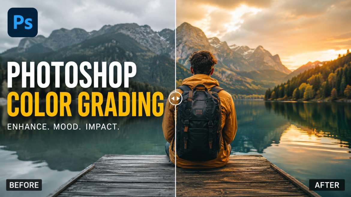
Photoshop color grading changes the visual mood of an image by shifting colors in the shadows, midtones, and highlights. To color grade in Adobe Photoshop, creators use the Camera Raw Filter or adjustment layers like Curves and Color Wheels. This process changes standard photos into cinematic art.
Photographers use this tool to apply warm tones for a happy feeling or cool blue tones for a sad mood. Good color work fixes bad lighting, builds a strong brand style, and helps photos look professional on websites.
Why Does Color Tone Matter in Photography?
I have spent ten years editing photos for major magazines. I know that raw images look flat. A camera captures light, but a creator captures feeling. Color changes how people feel when they look at your image. Warm yellow makes people feel cozy. Cool blue makes people feel lonely or calm. You need good color adjustment to stand out on social media. It changes a simple snapshot into a cinematic masterpiece.
You may also read :- Advanced Photoshop Tutorial: Master High-End Photo Editing
What is Photoshop Color Grading?
The Main Idea of Visual Toning
Photoshop color grading is the creative process of altering the colors in a photo. It differs from color correction. Correction fixes white balance and exposure mistakes to make the picture look real. Grading happens after correction to add artistic style.
The Power of Color Wheels
Adobe added a dedicated photoshop color grading tool inside the Camera Raw Filter panel. This feature gives you three distinct wheels. You control your dark areas, middle tones, and bright spots independently.
Step-by-Step Photoshop Color Grading Tutorial
You can learn the best way to edit your photos right now. Follow these simple steps to get a cinematic look.
Step 1: Open Camera Raw Filter
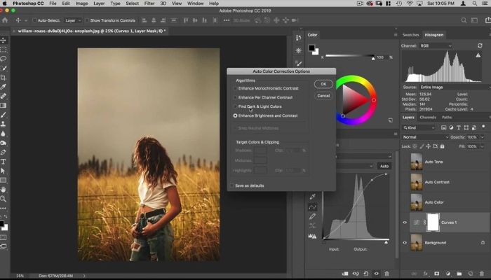
Open your image inside Adobe Photoshop. Duplicate your background layer to protect your original work. Go to the top menu, select Filter, and click Camera Raw Filter.
Step 2: Locate the Grading Panel
Look at the right side of your screen. Scroll down until you see the Color Grading section. Click the arrow to open the three color wheels.
Step 3: Adjust the Shadows
Select the shadows wheel first. Click the small circle in the middle of the wheel. Drag it toward teal or dark blue to give your dark areas a cool, deep look.
Step 4: Blend the Highlights
Move to the highlights wheel. Drag the center circle toward orange or warm yellow. This creates a beautiful contrast against your cool blue shadows.
Step 5: Tweak the Midtones
The midtones wheel controls skin tones. Keep this wheel close to the center so people look healthy and natural.
Essential Shortcut Keys for Fast Editing
Speed up your workflow with smart keyboard combinations. You can save hours of work every week when you use your keyboard instead of your mouse.
- Ctrl + Shift + A (Windows) or Cmd + Shift + A (Mac): This is the master Photoshop color grading shortcut key combination because it opens the Camera Raw Filter instantly.
- Ctrl + J (Windows) or Cmd + J (Mac): Duplicates your active layer so you can test new color choices safely.
- Alt (Windows) or Option (Mac): Hold this key while dragging sliders to see exact clipping points in your highlights and shadows.
Advanced Tools for Color Design
Curves Adjustment Layers
The Curves tool gives you ultimate control over your red, green, and blue color channels. Click the RGB dropdown menu to adjust separate color lanes. Raise the blue line in the bottom corner to add blue to your shadows.
Selective Color Options
This option lets you target specific tones without changing the rest of the image. You can select the red channel and add yellow to make brick walls pop. It works perfectly for fashion photography.
Color Lookup Tables (LUTs)
LUTs act like color blueprints. They map old colors to new colors instantly. You can load these files through an adjustment layer to get Hollywood movie tones in one single click.
Using Photoshop Color Grading Presets
Saving Your Own Styles
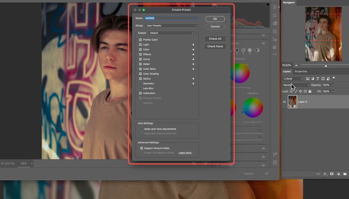
You do not need to start from scratch on every photo. Create a look you love, then click the three dots in the Camera Raw panel. Choose "Create Preset" to save your custom style.
How to Install Free Presets
You can download premium Photoshop Color Grading presets online. Drop these files into your settings folder. They apply complex color formulas to your images with one mouse click.
"Color is the keyboard, the eyes are the harmonies, the soul is the piano with many strings." — Wassily Kandinsky
Pro Tips for Clean Color Edits
Always Check Your Histogram
The histogram graph shows the distribution of your tones. Do not push your color circles too far. If you push too hard, you lose detail in your bright clouds or dark jackets.
Use the Blending Slider
The blending slider sits below the three color wheels. Move it to the right to mix the shadow and highlight adjustments smoothly. Move it to the left to keep the colors strictly apart.
Calibrate Your Monitor
Your edits will look wrong on other screens if your computer monitor shows incorrect colors. Use a hardware calibration tool every month to keep your workspace accurate.
Common Mistakes to Avoid
- Over-saturating the image: High saturation hurts the eyes of your viewers. Keep changes subtle.
- Ignoring skin tones: People look strange with green or blue faces. Protect the skin areas.
- Skipping color correction: Always fix your brightness and contrast before you start grading.
Creative Inspiration for Styles
| Style Name | Shadow Tone | Highlight Tone | Best Used For |
| Teal and Orange | Deep Blue-Green | Warm Golden Orange | Travel, Street Photos |
| Vintage Matte | Faded Soft Gray | Soft Cream Yellow | Portraits, Retro Shoots |
| Cyberpunk Night | Rich Purple | Bright Neon Cyan | Cityscapes, Rainy Nights |
Understanding AIO and Search Engine Needs
Modern search systems look for clear answers. When you use adobe photoshop color grading techniques properly, write down your steps simply. This clarity helps search assistants find your tips. It displays your helpful answers directly to users who need quick help.
Summary of Best Practices
Achieving great results requires balance. Start with a clean, color-corrected image. Use the dedicated photoshop color grading tool to separate your highlights from your shadows. Save your favorite styles as Photoshop Color Grading presets to build a consistent look across your entire portfolio.
Frequently Asked Questions
What’s the real difference between color correction and color grading?
Correction fixes what’s broken. Weird white balance? Ugly green skin? That’s correction. Grading? That’s adding a feeling. Moody blues. Dirty yellows. One makes it correct. The other makes it memorable.
Where is the actual color grading tool hidden in Photoshop?
Not obvious, right. Open Camera Raw Filter. Look on the right. There’s a section literally called “Color Grading.” Three wheels. Shadows, midtones, highlights. That’s it. Adobe buried it, but now you know.
Can I cheat and use my Lightroom presets inside Photoshop?
Yep. 100%. Same engine under the hood. Camera Raw doesn’t care if the preset was born in Lightroom. Just load it. Works fine.
Why does my grade look perfect on my monitor but like garbage on my phone?
Because phone screens lie. Every manufacturer tweaks colors differently. Samsung looks warm. iPhones look cooler. You can’t win them all. But calibrate your monitor to sRGB or Display P3, and you’ll get close enough for most devices.
How do I nuke it back to zero without resetting everything?
Double-click the little circle inside the wheel. Not drag. Double-click. Poof. That wheel is empty again. The other wheels stay untouched. Saved you fifteen clicks.