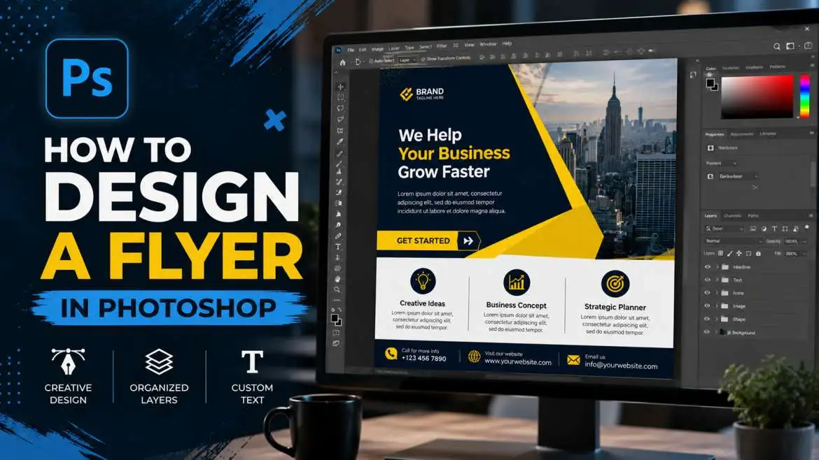
Honestly, making flyers is just one of those things everyone ends up doing at some point. You might be trying to push a weekend sale, map out a local event, or get a small business off the ground—either way, you just need people to look at the thing and get the info fast. Photoshop is perfect for this, but yeah, it's pretty overwhelming if you're new.
So I figured I'd write this up to just lay it all out from square one. We'll kick things off by getting the blank page sizes right, then move through it until we save the finished file—that way it won't look all pixelated and blurry once it actually hits the paper.
What Size is a Flyer in Photoshop?
Selecting the correct page size before adding shapes or text ensures crisp, sharp results. Choosing the wrong dimensions at the beginning often leads to blurry, low-quality images when the final flyer is printed on paper.
Common Flyer Sizes
- Your paper size really just depends on how you plan to hand the flyers out. For the most part, you’ll stick to three basic options.
- Your best bet is usually just standard letter size—literally the basic 8.5 by 11 inch paper you put in any home printer. It's perfect if you just need to tack a notice up on a local bulletin board, hand out flyers at a school function, or go around taping up business ads all over the neighborhood.
- Then you've got A5 ($5.8 \times 8.3$ inches). It's a lot smaller and fits nicely in your hand, making it the absolute best choice if you're going to be walking around handing them out to people on the street.
- Finally, a lot of people go with a half-page size ($5.5 \times 8.5$ inches). The big perk here is that you can fit two of them onto a single standard sheet of paper, which saves you a ton of cash on printing costs.
You may also read :- How to Use Layers in Photoshop: Step-by-Step Tutorial
How to Setup Your New File?
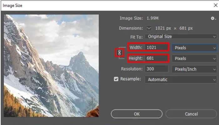
Open Photoshop on your computer and click the New File button. Look at the setup panel on the right side of your screen. Enter these exact settings:
- Width and Height: Change the measurement dropdown box from pixels to inches. Type your size numbers here, like $8.5$ for width and $11$ for height.
- Resolution: Type 300 in this box and make sure the dropdown says Pixels/Inch. Web pictures only need 72, but real paper print needs 300 to look sharp.
- Color Mode: Change this setting to CMYK color. Computer screens use RGB color, but printing machines use CMYK ink. If you select RGB by mistake, your printed colors will look dark and muddy.
Understanding Bleed Lines and Safety Zones
Printing machines cut hundreds of flyers at the same time with a large metal blade. Sometimes the blade shifts by a tiny amount. If your design goes right to the edge, a bad cut can leave a messy white line on the side of your paper.
To prevent this error, you need to use guidelines.
How to Create Guide Lines
- Look at the very top menu and click View. Then click Rulers so numbers appear around your canvas.
- Put your mouse pointer on the left ruler. Click and hold your mouse button down, then pull your mouse to the right. A blue line will follow your pointer.
- Drop this blue line exactly 0.25 inches away from the left edge of your page.
- Do this again for the right edge, the top edge, and the bottom edge.
The Three Canvas Rules
- The Outer Edge: Stretch your background color or background photo all the way past the blue lines to the physical edge of the digital page.
- The Cut Line: This is where the machine blade will cut your paper.
- The Safe Area: Keep your words, phone numbers, and logos inside your blue guide lines. If you put text outside these lines, the machine might cut your words off.
How to Design a Flyer Step by Step?
Now your blank page is ready for design. Follow these steps one by one to build your flyer.
Step 1: Add a Solid Background Color
A good background holds your design together. If your background has too many things going on, people will find it hard to read your words.
- Just drag your mouse over to the layers panel down at the bottom right of the screen. Look for that little square icon with the plus sign inside it and give it a click—that’ll drop a fresh, empty layer into your project.
- Find the Paint Bucket Tool on your left toolbar. It looks like a small bucket tipping over.
- Click the color square at the bottom of that same toolbar. Pick a color that fits your topic. For example, choose a dark green for a garden show or a bright orange for a food festival.
- Click your mouse once on the big blank canvas to pour the color onto your new layer.
Step 2: Write Your Big Headline
The headline is the first thing people see. It needs to be very large so people can read it from far away.
- Click the Horizontal Type Tool on your left toolbar. It looks like a capital letter T.
- Click your mouse near the top of your page inside your safe area lines.
- Type the main title of your event. Use all capital letters to make it look strong.
- Highlight the words with your mouse, then head up to the font menu at the top. You want something thick and clean here—think Arial Black or Impact. Stay away from cursive or script styles, since people can't read them at a glance.
- After that, crank the font size up until it fills out the whole top section of your page.
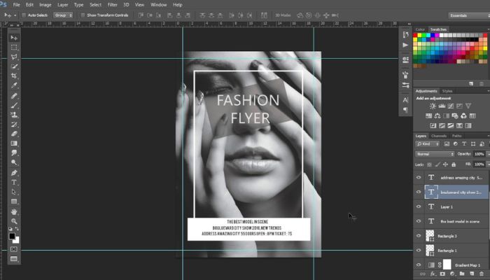
Step 3: Place Your Main Image
Pictures grab attention much faster than words. Use one big, clear picture instead of many small pictures to keep your flyer from looking messy.
- Go to the top menu, click File, and then click Place Embedded.
- Find the picture you want to use on your computer and click the Place button.
- A box with tiny squares on the corners will appear over your photo. Click and hold one corner square to change the picture size. Hold the Shift key down while you drag so your image does not stretch out of shape.
- Move the image to the middle of your flyer, just below your big headline text.
- Press the Enter key on your keyboard to fix the picture in place.
Step 4: Arrange Your Important Details
Now you must add the rest of your information. Group your words by size so readers know what to read first.
- Middle-Sized Text: Use this for the date, the time, and the place of your event. Make these letters half the size of your main headline so they look distinct.
- Small Size Text: Use this for extra descriptions or small details. Keep this font simple and easy to read.
Leave clear space around your words. If you crowd your text blocks too close to your photos, people will not want to read your flyer.
Step 5: Create a Call to Action
A call to action tells the reader exactly what to do next. You must tell them how to buy a ticket, join a meeting, or view a website.
- Go to your toolbar and select the Rectangle Tool.
- Draw a long box near the bottom of your flyer. Give this box a bright color that stands out from your background color.
- Select your Type Tool again and write your instruction inside this new box.
- Use short, clear phrases like "Go to www.site.com to sign up," "Call 555-0123 for a seat," or "Bring this flyer for a discount."
Simple Design Rules for Beginners
Making mistakes in Photoshop is common when you are first learning the software. Following a few foundational guidelines helps keep your design work clean, organized, and professional.
1. Use Only Two Fonts
Do not use three or four different fonts on one flyer. Too many styles look sloppy. Pick one bold font for your titles and one plain font for your smaller information text.
2. Keep Text Easy to Read
Always put light words on top of a dark background color. Put dark words on top of a light background color. Place dark text over a light background to ensure high readability. Using dark blue text on a black background creates poor contrast, making the flyer difficult or impossible for people to read.
3. Name Your Layers
As you build your flyer, your layers panel will fill up fast. Double-click the name of any layer to change it. Give your layers clear, descriptive names like "Main Title," "Event Date," or "Red Box." It takes two seconds now but saves massive frustration later when you need to jump back in and edit a specific element without digging through an endless list of generic layers.
Conclusion
Honestly, don't do it. Most stuff you find online is super low-res, usually just 72 dpi. The second you stretch that to fit a big paper canvas, it’s going to look like a blurry, pixelated mess when it actually prints out. Plus, you’re dealing with copyright issues since someone else owns those pictures. You're way better off using free stock sites that give you high-res files meant for printing.